
What the work was about
Thekganang Services brings a broader design system to its public-facing work, extending beyond the core logo & branding website into the practical materials around it.
The creative direction
The direction connects the visual language with the working formats around it, giving the project enough structure to remain clear across different moments of use.
What Lucidity delivered
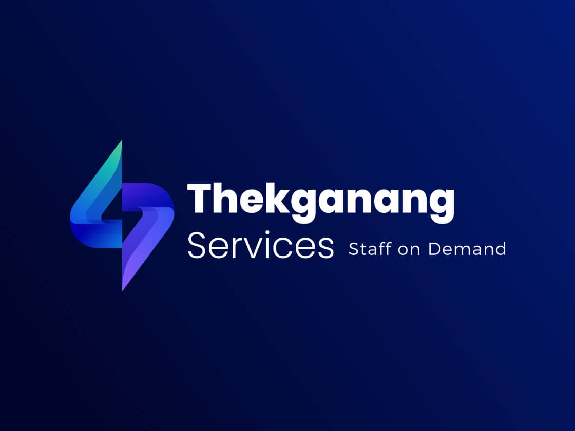
Thekganang Services logo is the live project record for one part of the work. The work covered strategy, design and development for the logo and website, including copywriting; a website care plan including hosting.
Services
- Logo & Branding
- Website
What this shows
A strong identity earns its place by staying recognisable when it moves from a mark into the digital experience and the materials people actually use.
If your next project needs a clearer route from idea to experience, talk to Lucidity.